Vores Side — from personalisation to participation
DR asked how its existing login could tie DRTV, DR LYD and DR Nyheder together. We answered a different question: what would make logging in worth doing at all for a publicly funded broadcaster?
What DR asked
DR has one login across DRTV, DR LYD and DR Nyheder, and a goal of reaching 8 out of 10 people in Denmark through its digital platforms. The login saves viewing and listening activity and gives DR a stronger data foundation, but the platforms still operate separately.
The brief, as presented, was cohesion: get more people to log in, and make the three platforms feel like one service.
What we asked instead
How might DR use its existing login solution to strengthen digital cohesion across its main platforms, while also making the login experience feel valuable and engaging for users?
That moved the project from interface optimisation to a public-service question. Login is the point where a licence-funded institution asks something of a citizen — so it has to give something back that a commercial platform would not.
Two expert interviews at DR, twenty-five with its users
We interviewed DR’s Product Manager, who described login as underused and often experienced as annoying, and later DR’s Media Analyst, who explained how little DR knows about users who are not logged in — and how carefully DR has to handle data as a non-commercial institution.
In parallel we ran semi-structured interviews with 25 people aged 18–30, DR’s stated target group, about their media habits and their view of the login. The dominant response to logging in was irritation: DR had always been freely available, so why the gate?
The second finding was the one that redirected the project. Users did not want personalisation from DR at all.
“Public service shouldn’t recommend content, it should provide a broader perspective.”
“If DR starts recommending things, you get put in a box — and that’s dangerous for public service.”
From Min Side to Vores Side
Our early concepts had circled around Min Side — my page — because that is the shape personalisation usually takes. The interviews made that direction untenable: people were explicitly asking DR not to behave like Netflix.
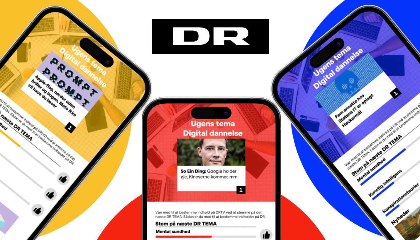
So the concept became collective rather than individual. Vores Side — our page — is a shared space reached through login, where content is organised around a weekly theme that users vote on, and where the same space appears inside all three apps.
The concept
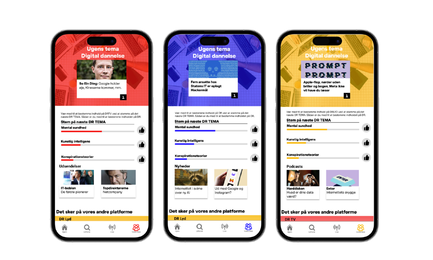
Five parts, one shared page
- Weekly theme
- The top of the page carries the current theme and one featured piece of content that anchors it — for example a climate theme drawing together articles, documentaries and podcasts.
- Voting
- Users vote on next week’s theme from several proposals. The most-voted theme guides the following week’s supplementary content across the three platforms.
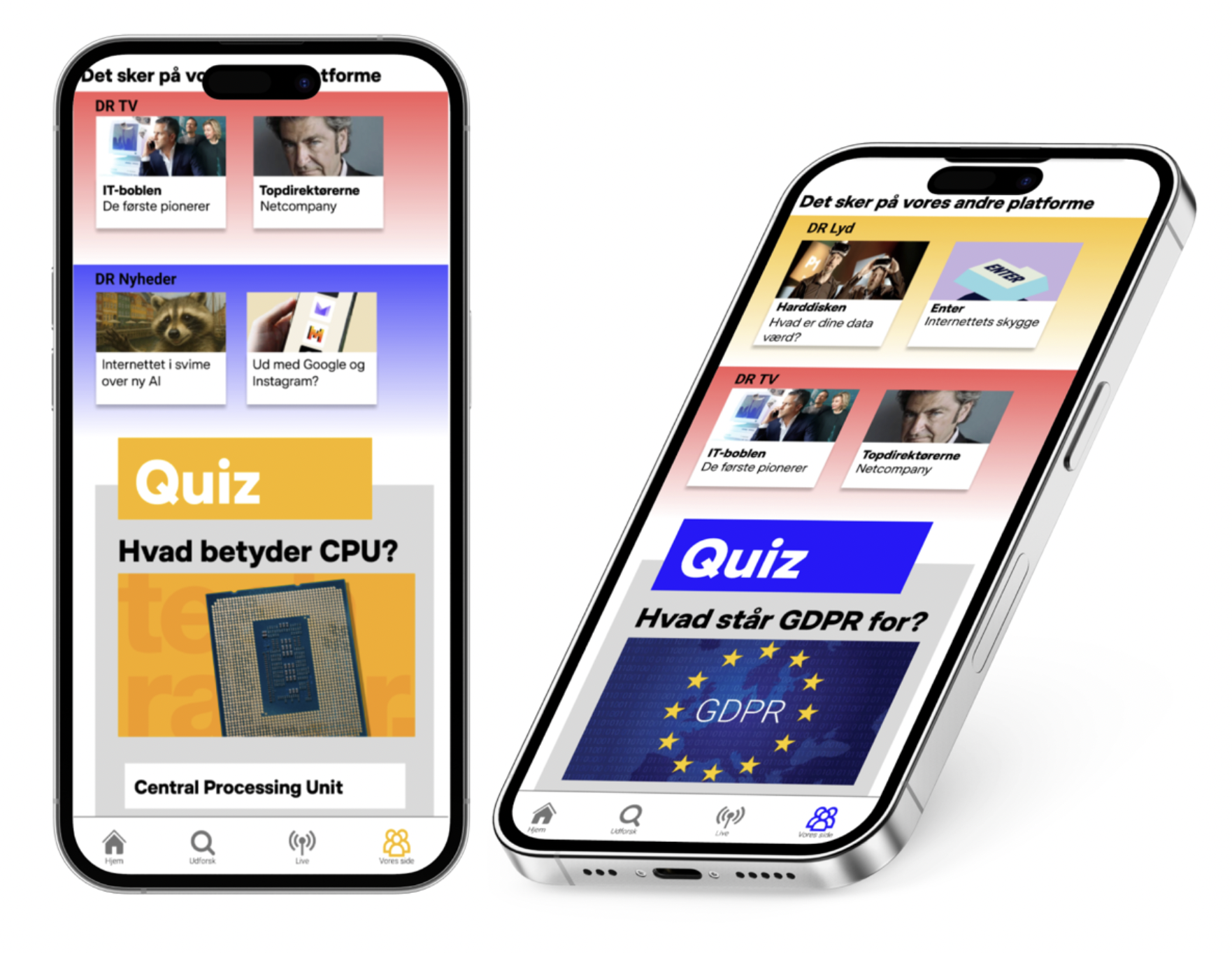
- Quiz
- A short quiz on the theme — a low-stakes way in, and a focal point that makes the theme something to talk about.
- Cross-platform teasers
- “Det sker på vores andre platforme”: visual previews that link straight into the relevant article, documentary or podcast on DR’s other services.
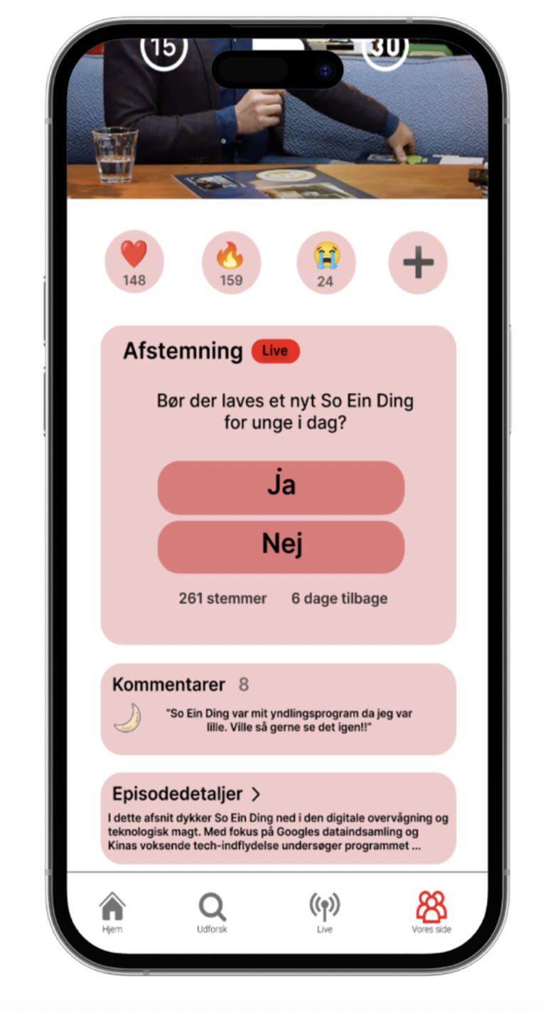
- Feedback
- Emoji reactions, yes/no polls and comment fields — available to logged-in users only, which is where the value of logging in becomes concrete. It answers DR’s own wish for qualitative feedback.
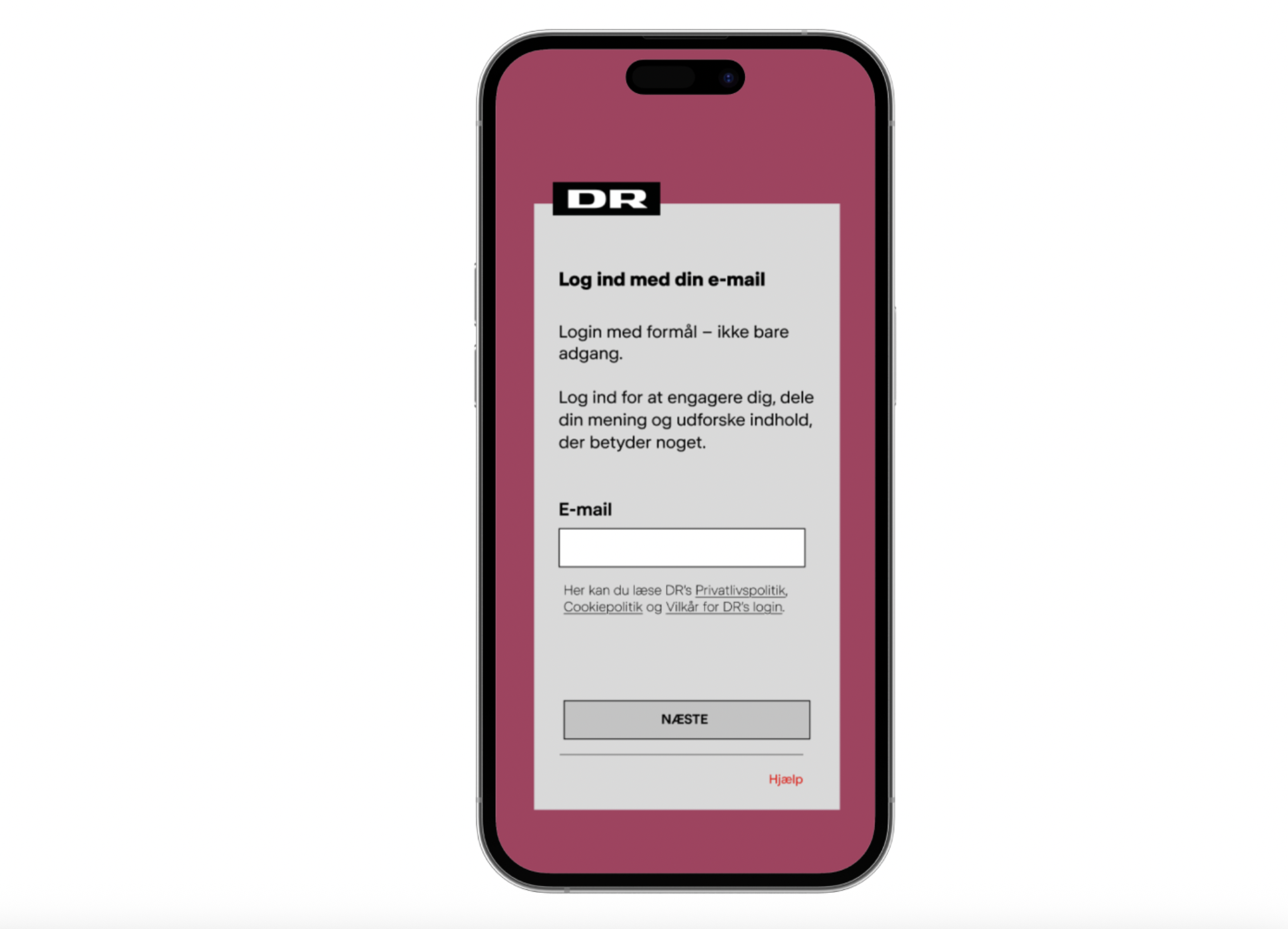
Before
A technical gate. It saves your place and unlocks some content, and it explains nothing about why it exists — which is exactly how our participants described it.
After
“Log ind med et formål – ikke kun adgang. Log ind for at deltage, dele din mening og finde indhold, der betyder noget.”
“Login with purpose — not just access. Log in to engage, share your opinion, and discover content that matters.” No new functionality: a rewritten screen that makes what follows legible.
One footer, three identities
To make the three apps feel like one service we unified the footer across DRTV, DR LYD and DR Nyheder, with Vores Side reachable from the same place in each. The layout of Vores Side is identical on all three; only the platform colour changes, so the apps stay recognisable without flattening into one another.
Four sessions, and a pitch to DR
The prototype was tested with four users aged 18–30: task-based usability first, then a short interview about motivation and perceived value. Navigation held up — the interface relies only on scrolling and tapping, and participants found the voting mechanism immediately.
The concept landed as intended. Participants described logging in as taking part rather than being counted, and said the experience would make them more likely to return. We then presented Vores Side to DR with a walkthrough of the prototype.
“It feels like the same DR across platforms. It makes me want to go from reading to listening, because it all connects.”
The organisational condition we could not design away
Vores Side only works if DR acts on what users send back. Login currently sits with product and data teams; weekly themes, voting and feedback need editorial ownership as well, and a definition of engagement that is not clicks. We said so in the report rather than presenting the concept as self-sufficient — participation that is never answered is decoration.
I worked across the full process: user research and interviews, analysis, concept development, iterative prototyping in Figma, and developing how the concept would work across DR’s three platforms.
Group project, Digital Innovation in Practice, IT University of Copenhagen, 2025.
Methods
- Desk research on DR’s 2025 strategy
- 2 expert interviews (Product Manager, Media Analyst)
- 25 semi-structured user interviews, ages 18–30
- 6-3-5 brainwriting
- Sketching and iterative Figma prototyping
- Usability testing and qualitative evaluation with 4 users
Tools
- Figma
- Semi-structured interviews
- Affinity-style synthesis